
A recent prototype design your team has worked on features horses strikingly embossed with hot foil. What inspired you and the team to work on this concept?
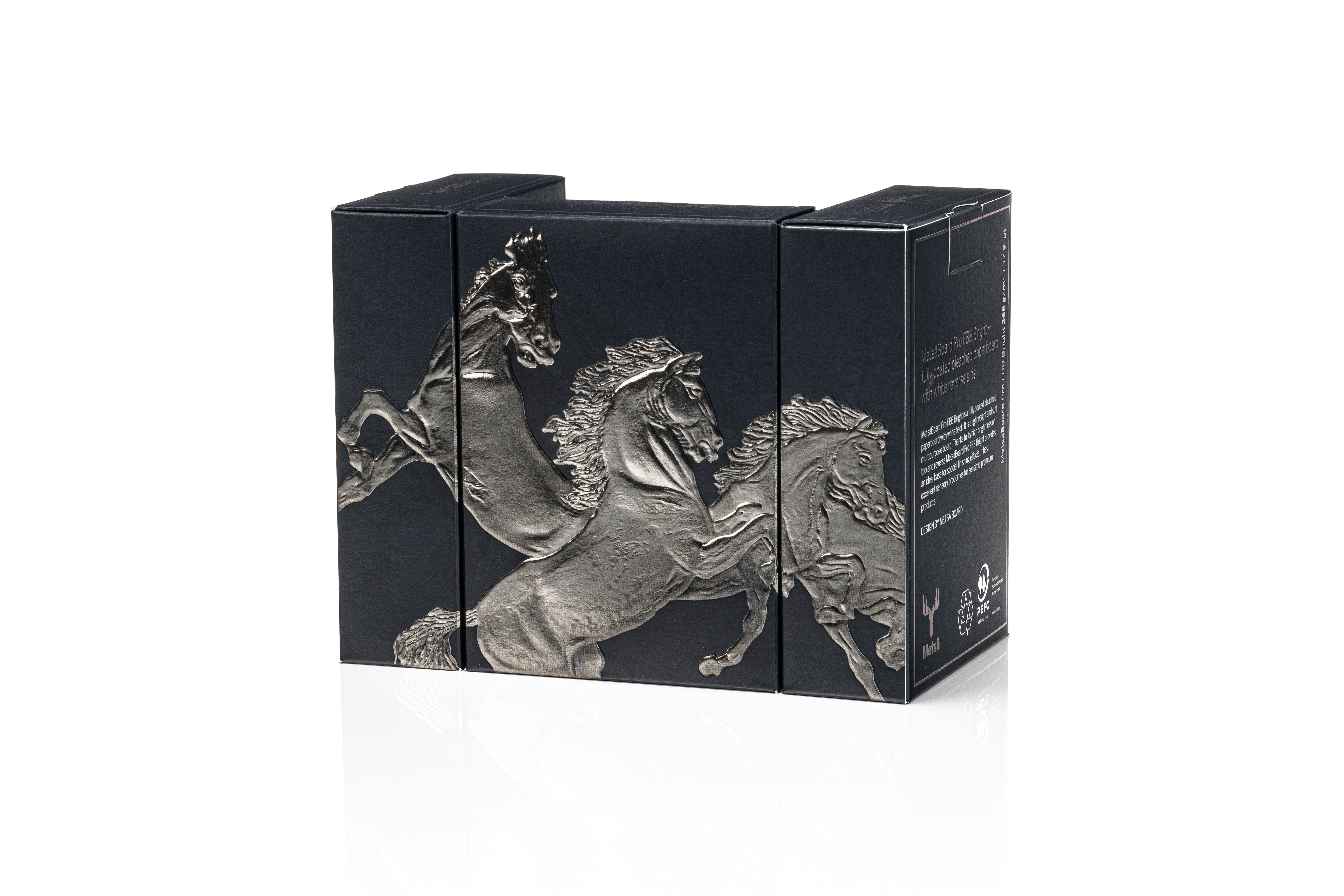
Marko: The inspiration came from previous work we did for a brochure where we experimented with multi-layer embossing. We wanted to showcase the capabilities of our paperboards with deep black printing and metallic hot foil embossing in a way that would be visually compelling and technically impressive. We chose the horse motif because it creates a sense of movement and luxury, and that’s ideal for gift sets and premium fragrance packaging for men, for example.
Was the primary objective to create a design that would boost shelf appeal for brand owners, similar to the V Engine concept?
Marko: Yes, absolutely; deep black printing and metallic embossing create a premium look that stands out on the shelf. The interplay of matte and glossy elements also plays a big part in the packaging, making it eye-catching for consumers from different angles. Luxury brands, especially in cosmetics and fragrances, are always looking for ways to elevate their packaging, and our design team felt like this concept provides a visually sophisticated and technically refined solution.
What technically sets this one apart if we compare it to your other prototype concepts?
Marko: One of the things we worked on the most for this concept was trying to achieve the perfect balance between the deep black background and the reflective foil embossing. What sets this concept apart is the gunmetal foil we used for the embossing, which adds a dynamic interplay of light and shadow, making the design appear almost three-dimensional. Also, printing on deep black can be pretty challenging, so we wanted to make sure the black ink saturation wasn’t too high because then the details in the foil could get lost; if it were too low, the contrast wouldn’t be strong enough.
How does paperboard quality impact the feasibility of these prototype designs?
Marko: Deep black printing is quite tricky because it tends to absorb too much ink, which can make the details disappear into the background and obscure the finer graphical details. We carefully balanced the ink application to maintain crispness and ensure the horse figure remains highly visible. But the key here was also to use a high-quality coated paperboard that keeps the ink on the surface while preventing excessive dot gain. Our MetsäBoard Pro FBB Bright product was perfect for this because it has an exceptionally smooth surface that allows for sharp, high-contrast printing without colour degradation or cracking at the folds.
Beyond the technical aspects, how do you design concepts so they can evoke the right emotional response from shoppers?
Marko: Luxury packaging needs to immediately impact the consumer as it’s all about perception—how a product feels in your hands, how light interacts with the surface, and how the design tells a story. With this concept, we wanted to create a sense of exclusivity and craftsmanship. When a consumer picks up a package like this, they should immediately associate it with high-end quality.
How customisable is this concept for brand owners who want to use it but might have their own specific branding in mind?
Marko: The horse design is just one example of what can be done with these characteristics. We could easily replace the horses with a different motif that matches a customer’s brand image; of course, we can also adjust the foil colour or modify the embossing pattern to match their identity. It’s a highly customisable concept, but I think it stands out most because it maintains a premium appeal that so many brand owners are searching for these days.
Don’t miss Part 1 of the interview series, where Marko discussed the new V Engine packaging concept inspired by his love for motorcycles.