


The forest- and nature-informed colour palette is an important factor of Metsä Group’s visual identity to ensure recognition and differentiation. This section contains the colour specifications for the Metsä Group.

The Metsä Group colour palette
Colour swatches
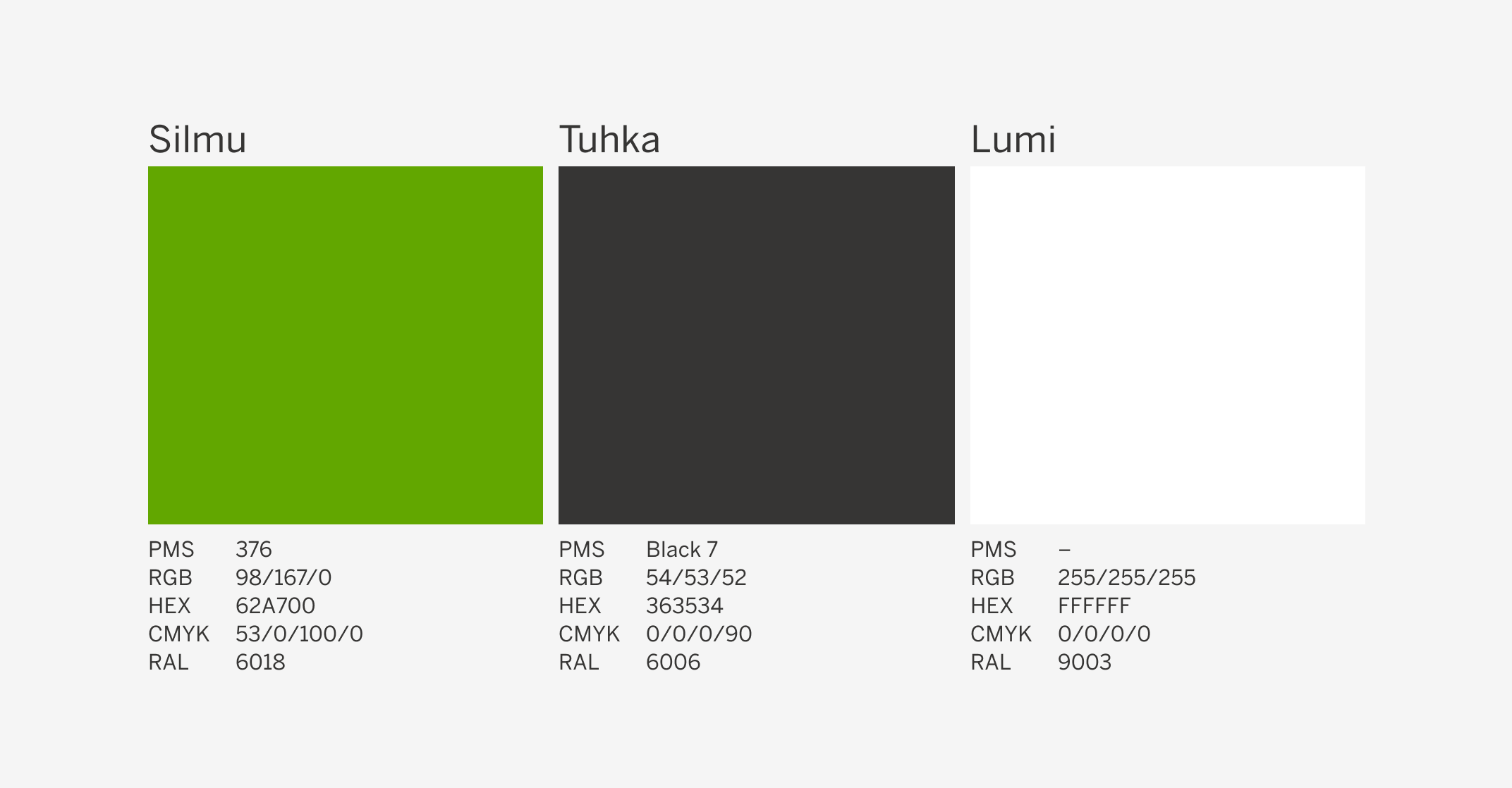
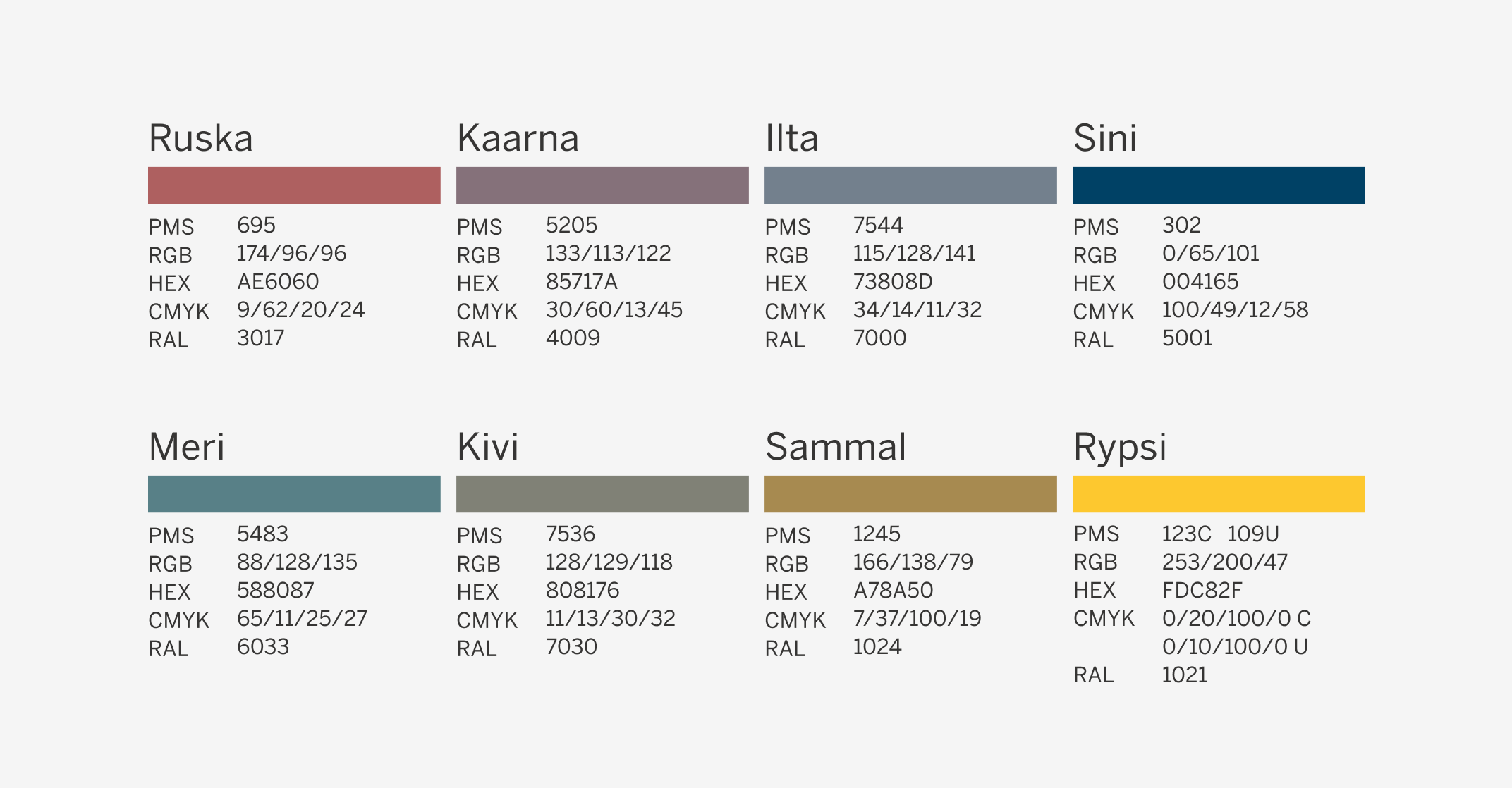
Metsä Group’s colour palette consists of primary identification colours and additional accent colours. Each colour is specified for different media and production methods.
Four-colour values (CMYK) are applied for four-colour printing. (Specific CMYK-values have been defined for both coated and un-coated paper.)
In digital environments use the RGB colours.
Colour in use
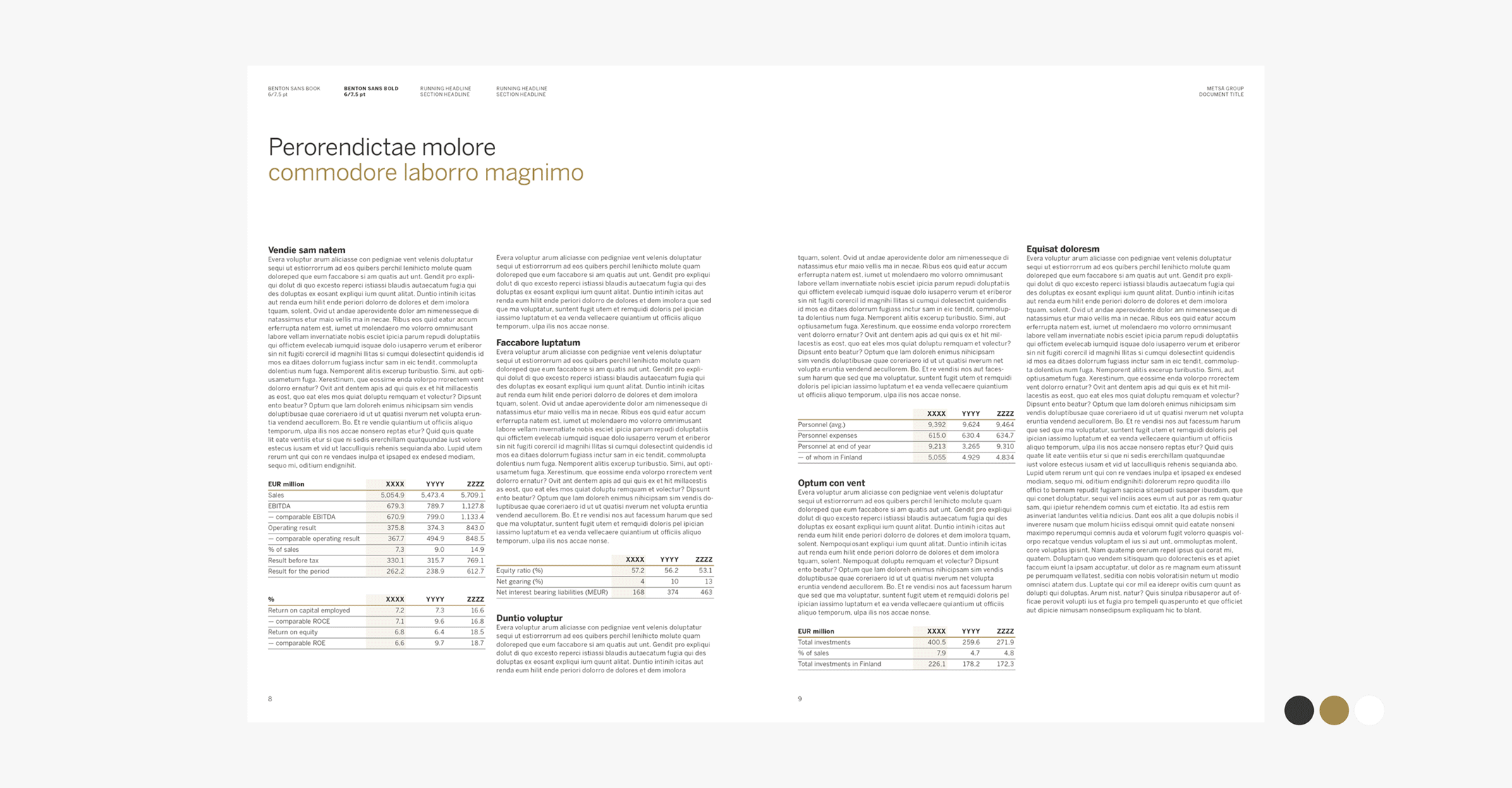
Here you will find a best-practise showcase of the purposeful use of primary and accent colour palettes across various applications.
The primary palette should be used in most situations. Its systematic use ensures the recognizability of our brand identity.
Silmu green is primarily intended as an identification accent - for example, in the moosehead, and should not be used in other contexts.
White should also be considered as a colour: serenity and clarity are achieved for example in a brochure by leaving plenty of empty space in the execution.
The primary palette remains dominant in the "facade" or the first entry point of an individual application, while the use of accent colors can take on a more prominent role e.g. on the inside pages in structuring the actual content
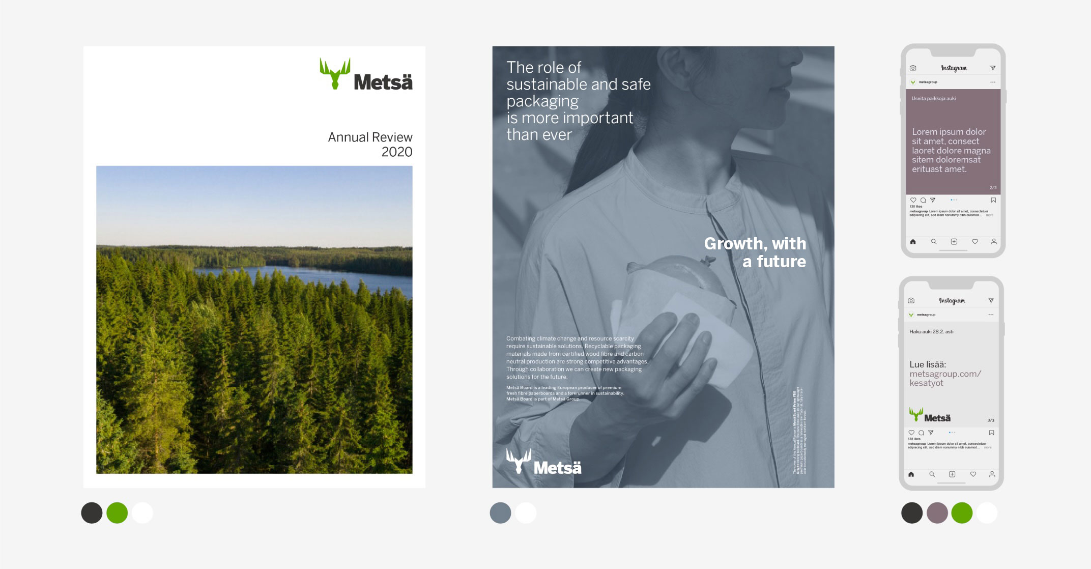
Accent colours should be used functionally to structure and separate different content entities. It is recommended to retain the same accent color in different tints throughout an individual content section.
Want to read more?
A pdf version of the guidelines can be downloaded from the following link in case you need a printer-friendly off-line hard copy of the guidelines.